The Art of the Blend: How to Mix Wood Tones Like a Pro
For a long time, the unwritten rule of interior design was "matchy matchy." If your dining table was cherry, your chairs, sideboard, and flooring better be cherry too. Thankfully, those days are over.
Mixing wood tones is the secret sauce to making a home feel curated, warm, and intentional, rather than like a page out of a furniture catalog. But there’s a fine line between eclectic charm and total chaos. Here’s how to navigate the grain and create a cohesive look.
1. Identify the Undertones
This is the golden rule. Just like paint or skin, wood has undertones. Even if you are mixing different species of wood, they should generally share the same temperature.
Warm Undertones: Look for yellow, orange, or red hues (think Cherry, Mahogany, or Hickory).
Cool Undertones: Look for grayish or greenish tints (some White Oak, or certain Walnuts).
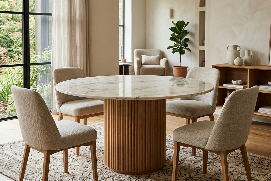
Neutral Undertones: These are the unicorns of the wood world (like White Oak) that can play well with both sides.
Pro Tip: If your floor is a warm oak, try to keep your large furniture pieces in the warm family to avoid a visual clash.
2. Pick a Dominant Tone
Every room needs a protagonist. If you have beautiful hardwood floors, that is your dominant tone. If you have carpet but a massive walnut dining table, that’s your lead.
Once you identify the dominant wood, every other wood piece you bring in should serve as a supporting character. Don’t try to give four different woods equal screen time, or the room will feel restless.
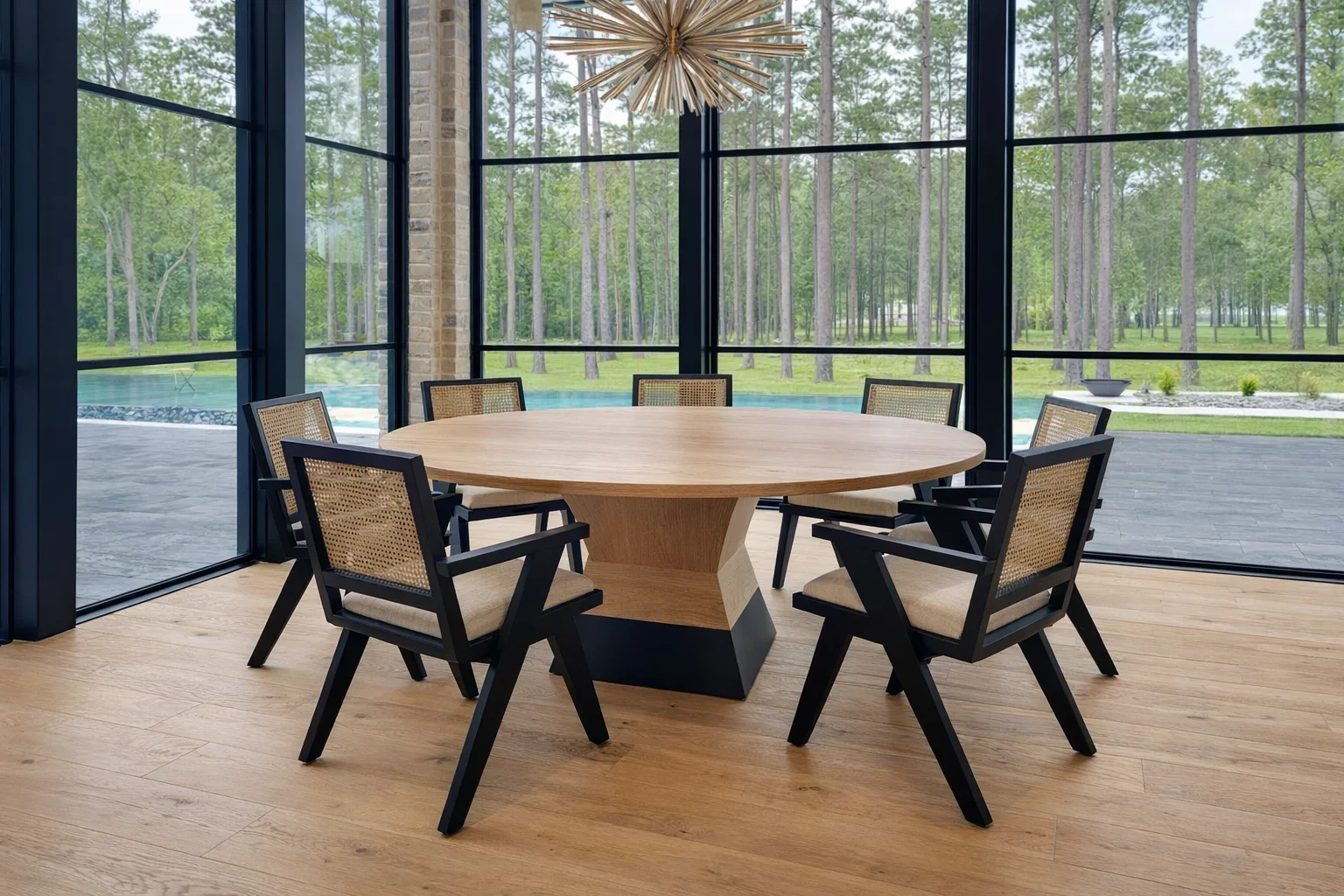
3. Contrast is Your Friend
One of the biggest mistakes people make is trying to get woods to almost match. If you have a medium-toned oak floor and you buy a medium-toned maple table, they will look like a near miss.
Instead, go for high contrast.
If your floors are light, try an Ebonized or dark Walnut coffee table.
If your walls are dark wood paneling, go for light, honey-colored accents.
Design Note: Contrast creates visual breathing room between surfaces, allowing each piece to stand out.
4. Use a Bridge Piece
If you’re feeling nervous about your dark mahogany desk sitting on your light pine floors, look for a bridge. A bridge is an item that contains both tones or helps transition between them.
A Patterned Rug: A rug with bits of brown, tan, and cream can physically separate the wood of the floor from the wood of the furniture.
Art or Decor: A picture frame or a wooden bowl that incorporates multiple wood grains can make the mix look intentional.
5. Repeat Each Tone
A random wood grain that appears only once in a room can look like an accident. To make it look like design, repeat that tone at least twice.
If you have a dark wood bookshelf, try adding a dark wood picture frame on the opposite wall or a dark wood tray on the ottoman. This scatters the color throughout the space, creating a sense of rhythm.
6. Break it Up with Texture
If you’re worried about wood overload, break up the grain with different materials. Use metal, glass, marble, or painted surfaces to act as a buffer. A set of black metal legs on a wood table, for example, provides a visual reset that makes the wood tones more digestible.
The Bottom Line
Don't overthink it! The most beautiful homes feel lived in and evolved. As long as you keep the undertones consistent and provide enough contrast, your mixed wood tones will look like a professional designer’s masterpiece.